Application Observability
Monitoring SLIs and SLOs
Zac Bergquist
Service Level Indicators (SLIs) and Service Level Objectives (SLOs) are two of the most important concepts in Site Reliability Engineering (SRE), and are key to establishing an observability culture. It all starts with identifying the right SLIs. Think about the key features and workflows that your users care most about, and choose a small number (think three to five per service) of SLIs that represent the availability of these features. For example, if you are running an eCommerce service you may choose to measure the percentage of “add to shopping cart” operations that succeed. Next, choose an appropriate objective for each of these indicators. Avoid spending too much time debating the initial SLO - your first attempt will almost certainly need adjustment. A good guideline is to start with an initial SLO much lower than you think you’ll need, and fine-tune this number as necessary.
Once you’ve identified the SLIs and SLOs for your service you need to start measuring them. SLIs are typically measured over a rolling window so that the effects of an availability-impacting incident “stay with you” for some amount of time, before rolling out of the window. This approach helps teams to adjust their behavior in order to avoid multiple incidents occurring in a short amount of time, which leads to unhappy users. Since many services have different usage and traffic patterns on weekends, we recommend a 28-day rolling window - which ensures you’ll always have four weekends in the window.
Measurement
In this guide we’ll cover two simple frameworks for structuring your metrics in a way that facilitates this type of monitoring. While these two approaches might not work for every scenario, we’ve found that the majority of SLIs can be measured in this way.
The first approach uses a single gauge metric. A gauge is a metric whose value
can increase or decrease over time, but in this approach we limit the value of
the gauge to 1 (last probe was successful) or 0 (last probe was unsuccessful).
Prometheus’ up time
series works in this way.
The second approach uses two counter metrics. A counter is a metric whose value only increases with time (think total number of page views or total number of error responses). In this approach, the first counter represents the total number of probe attempts, and the second counter represents the total number of successful (or unsuccessful) probes.
The examples that follow will use Tanzu Observability by Wavefront for the storage and visualization of this data, but the concepts can be applied to any system that can store and display time-series data.
Monitoring SLIs with a gauge metric
This approach exposes a single metric that is either 1 or 0 at all times. For example, a probe could periodically test an application feature and set the value of the metric to 1 if the operation succeeded, or 0 otherwise.
The raw metric may look like this:
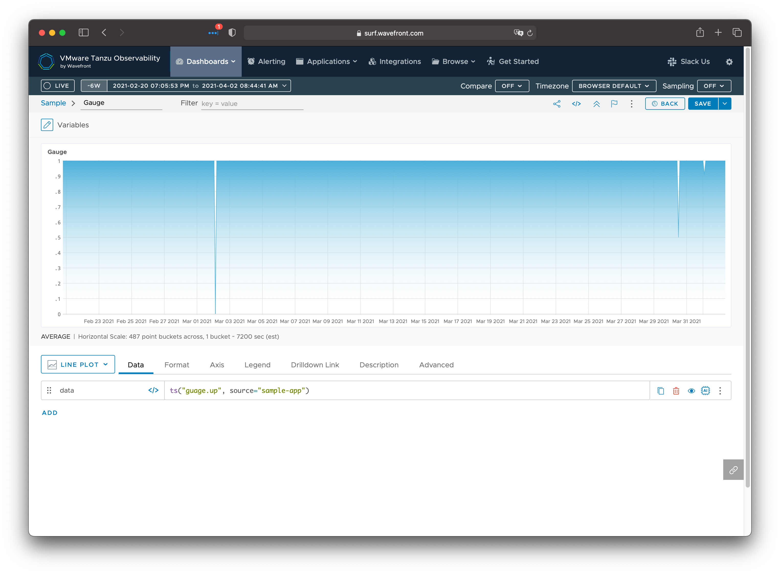
In this example, the probe was successful for all times except for a 2 hour block on March 2, a 1 hour block on March 30, and a 10 minute block on April 1.
If our SLO is the percentage of attempts that succeeded over our time window, then we need to determine both the total number of attempts in that window and the number of them that were successful. For the total number of attempts, we simply count the number of samples in the window (all 0 and 1 values). Since the value of the metric is always 1 when the operation is successful, we can simply sum all the samples in the window to get a value that represents the number of probes that were successful.
We can use the mcount and msum
moving window functions
to build the queries. For a metric named gauge.up, we would have the following
queries:
- Attempts:
mcount(28d, ts("guage.up")) - Successes:
msum(28d, ts("gauge.up"))
With this in place, the current SLO attainment is simply the ratio of successful attempts to total attempts. We can also plot the target SLO to make it easier to gauge how we’re doing at a glance.
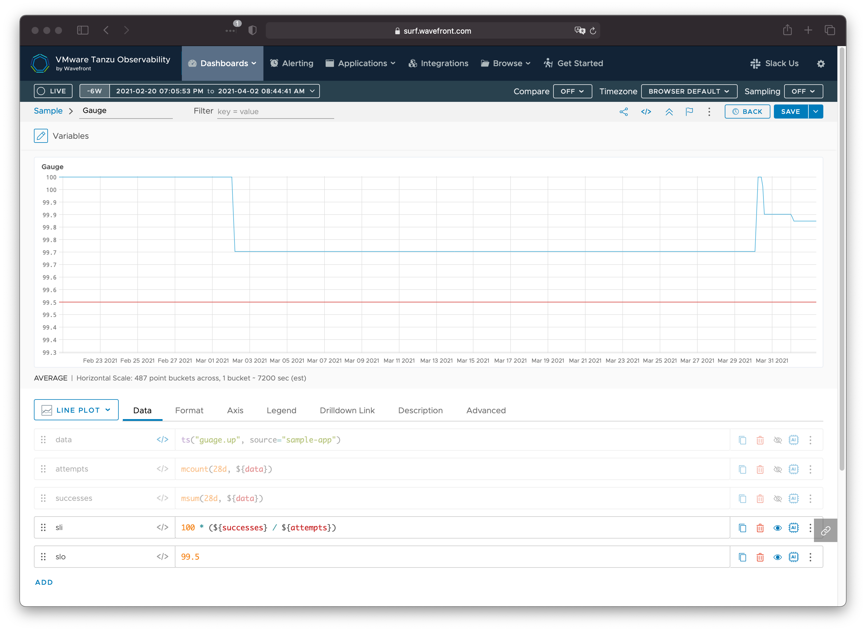
Here we can see the 2 hour outage on March 2 took our availability from 100% down to 99.7% (still above our 99.5% SLO). The impact of the outage remains for 28 days, and the error budget is recovered on March 30, bringing the availability over the window back to 100%. This is short-lived, as the subsequent outages on March 30 and April 1 consume additional error budget, which will be reclaimed 28 days in the future.
Monitoring SLIs with two counter metrics
An alternative way to measure this type of data is to use two separate (but related) counters. The first counter represents the total number of attempts, and is incremented every time a probe is performed. The second counter is the number of successful attempts and is incremented only when the probe succeeds. If all is going well, these two counters increase at the same rate. When the system is unhealthy and some operations are failing, the total attempts counter will increase faster than the successful attempts counter. The tricky thing about counters is that they map “wrap” or reset due to a process restart or the maximum integer value exceeded. For example, here’s a counter showing the total number of attempts for the same sample:
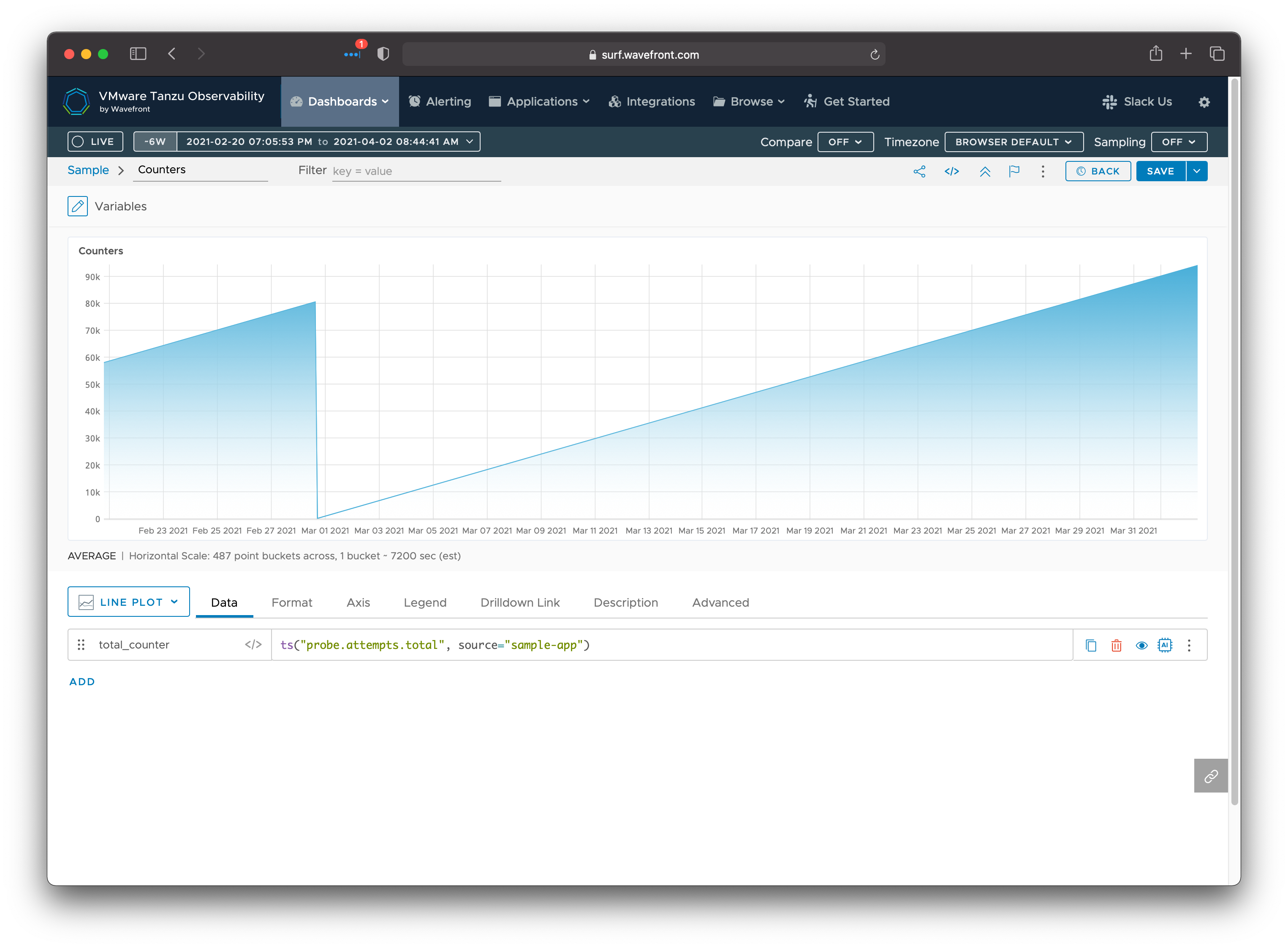
In this example, a counter reset occurred sometime around March 1. A naive query
that simply looks at a counter value prior to March 1 and again after March 1
may think that the total number of attempts decreased. For this reason, it is
important to use query functions that can handle counter resets. In Wavefront
Query Language, the ratediff
function can be used to find out how much a value has increased from one sample
to the next, even in the face of counter resets. We combine this with the moving
sum of those increases over our 28 day window to get the total number of
attempts (or successes). For counters named probe.attempts.total and
probe.successes.total we would have the following queries:
- Attempts:
msum(28d, ratediff(ts("probe.attempts.total"))) - Successes:
msum(28d, ratediff(ts("probe.successes.total")))
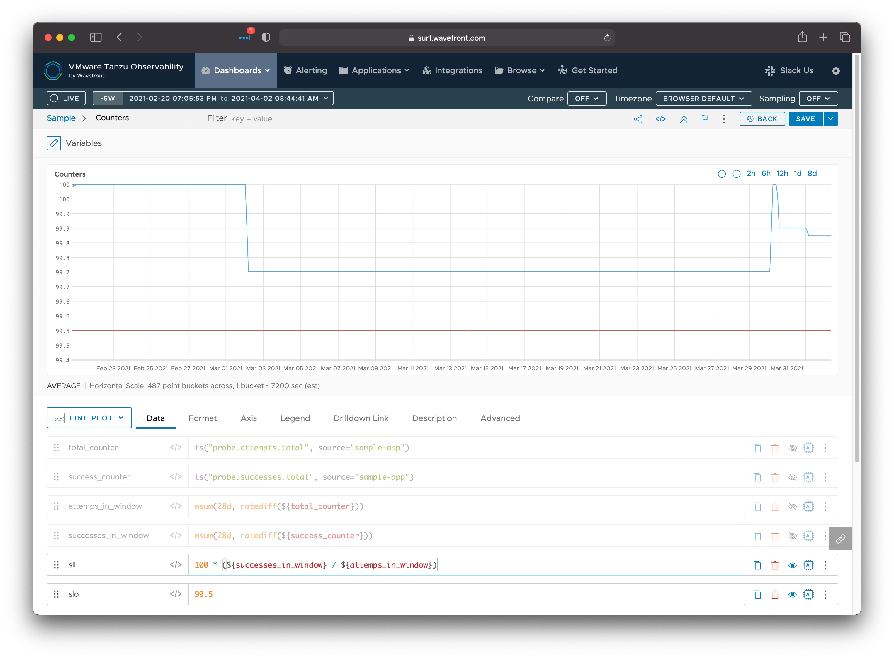
As you can see, this produces an availability graph with the same shape as the gauge example.